

Some of the key differences between CRI and TM-30 are the former uses eight color samples as reference. In addition to the limited color samples, all of the representative colors are pastel and do not properly represent a light source’s ability to render red. In response to this gap, a ninth color sample (i.e. red) called R9 was created. This R9 sample is sometimes referenced specifically in addition to CRI to provide some context on the red fidelity of a light source. On the other hand, TM-30 uses 99 color samples. These were scientifically chosen to represent millions of colors, and can also provide information on hue, chroma, and lightness for each sample. The same information—the spectral power distribution of the light source (i.e. the representation of the power emitted by a light source at each or band of wavelength)—is used to derive the data for both CRI and TM-30. However, the latter provides a more detailed description of the light quality.
TM-30 conveys information relative to the primary parameters of color fidelity (Rf) and gamut (Rg), and it also provides a color vector graphic as a visual representation of the deviation between the gamut area of the light source compared to that of the blackbody radiator.
The color fidelity index measures the fidelity (i.e. accuracy) of a light source with a reference illuminant on a scale from zero to 100, making it very similar to CRI. For many of the blue-pump phosphor LEDs currently in production, Rf is very close to CRI with the former being slightly lower. However, with new technologies like narrowband phosphors and quantum dots, larger differences may be observed as the 99 color samples of TM-30 provide a fidelity reference across all rendered colors.
The gamut index signifies how much saturation a light source has. An undersaturated light source makes colors appear pale or whitewashed, while an oversaturated illuminant renders more vibrant colors. The gamut index is expressed with positive and negative numbers, providing a reference to the quantity of change as well as the direction of the change (if the source is over- or under-saturated), which is one of the limitations of CRI and the color fidelity index.
Information regarding local color fidelity and chroma and hue shift for all 16 hue bins was added to TM-30-18. The color spectrum of the light source is divided into 16 equal pie slices, allowing one to obtain specific information relative to the hue and chroma of each. Therefore, an oversaturation in the red spectrum or an undersaturation in the green spectrum can be identified. This updated technical memorandum is timely with light quality initiatives that are constantly growing in importance.
Quality of light initiatives
Some examples of quality of light initiatives actively being discussed in the industry include:
- circadian lighting – aims at improving sleep and mood by providing the right light spectrum for the time of day;
- warm dimming – replicates the quality of a halogen light source when an LED luminaire is dimmed down (this is commonly used in restaurants and other hospitality spaces where a warm and intimate ambiance is desirable, but often results in a warmer light and a color temperature inconsistent across the range);
- color tuning – often associated with circadian lighting but is a separate subset as it can also be used for preference without trying to align with and stimulate the human circadian cycle;
- spectral tuning – specialty lighting used in retail environments (e.g. the light spectrum of LEDs is tuned to create a specific effect, such as having the meat displayed in a meat locker appear as red and as fresh as possible, or for the clothing in a retail store to pop more); and
- human preference – providing a light quality humans prefer overall and that will, as a result, make them feel more comfortable and at ease in an environment.
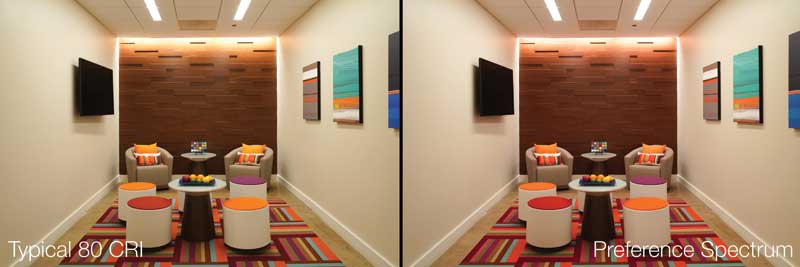
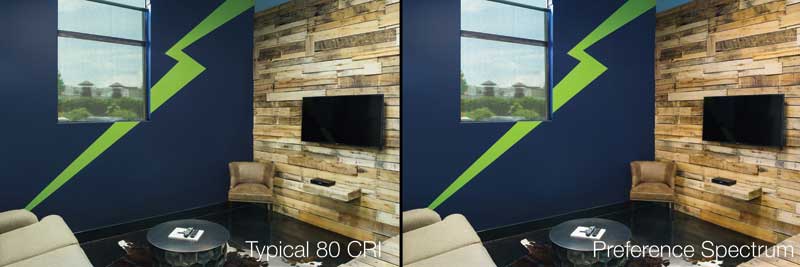
Several recent studies that have converging conclusions support the human preference initiative and define a spectrum preferred by humans regardless of gender, age, or cultural background.
Research in human preference lighting
Independent studies conducted in North America and Asia draw similar conclusions as to what quality of light appeals most to human beings.
The Pacific Northwest National Laboratory (PNNL) published the first study in 2015 at about the same time IES released the TM-30 technical memoranum (Get more information on the research by reading, “Human perceptions of color rendition vary with average fidelity, average gamut, and gamut shape” by M. Royer, A. Wilkerson, M. Wei, K. Houser, and R. Davis, published in 2016 in Lighting Research & Technology). Observers were exposed to a space filled with recognizable branded objects, such as soda cans, fruits and other organic items, and clothing. A mirror was also present in the space so participants could observe their skin tone under different light conditions. The spectral power distribution of the light source was changed throughout the day.
The test was done in a manner similar to an eye examination, where participants were asked: “Do you like this, or that?” as light sources were modified throughout the test. They were exposed to high fidelities such as 100 CRI, and then it went down to 80, 70, and even 50 CRI, all at 3227 C (3500 K). The sources were also over- and under-saturated.
When the research team ran the results against statistical models, interesting trends emerged. They discovered the fidelity of the light source, contrary to common belief, had little correlation to preference. On the other hand, saturation, especially in the red spectrum, made a light source preferable. They defined preference with the following simple equation:
Preference = Fidelity + Red Saturation
The research team also recommended a fidelity greater than 74, and a red oversaturation between two and 16 percent, with an oversaturated gamut index.

