Advancing the quality of light
Second came a study from Pennsylvania State University (PSU) employing a different methodology, but concluding with similar findings (Read “Models of color quality over a wide range of spectral power distributions” by T. Esposito and K. Houser, published in Lighting Research & Technology in 2018). Researchers conducted an absolute test as they outfitted a viewing area with common, colorful branded objects and organic items and showed participants one light source per day. This study was done at 3227 C (3500 K), and observers made judgments on many aspects of each light source, including preference.
Several spectrums—some with high fidelity and good gamut, others oversaturated, and the rest undersaturated—were tested. Although the format and methodology was different, preferred light sources fell in the same range as the PNNL study. Once again, the results did not show a strong correlation to fidelity but rather a robust connection to saturation.
Two more studies have since been published on the topic. PNNL did a follow-up study employing the same methodology but showing light sources in five different chromaticity groups, between 2427 C (2700 K) and 4027 C (4300 K), and found similar preference results consistent between the various color temperatures (Consult “Human Perceptions of Color Rendition at Different Chromaticities” by M. Royer, A. Wilkerson, and M. Wei, published in 2017 in Lighting Research & Technology).
The last study was conducted by researchers at Zhejiang University in China (For more information, read “Toward a unified model for predicting color quality of light sources” by F. Zhang, H. Xu, and H. Feng, published in 2017 in Applied Optics). They showed a total of 164 lighting scenes in four chromaticity groups, ranging from 2527 C (2800 K) to 6227 C (6500 K), and drew similar conclusions relative to preference. As the first study to take place outside of the United States, it also demonstrated preference is not conditioned by culture or the habitual built environment and transcends borders.
Defining a model for color preference
Using the parameters of TM-30 and the conclusions of the aforementioned studies, simulation spaces were set up in a private office in Chicago for several months in 2017 and 2018. While not scientific, this study allowed observers to spend extended periods of time under several preference models in their normal working environment. It also made it possible to collect feedback from visitors about three light sources, all falling within the spectrum defined by the PNNL, PSU, and Zhejiang studies.
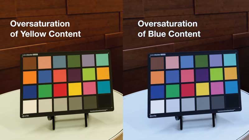
The three preference models tested modulated the red saturation, hue bins one and 16, between –1 and 14 percent, while maintaining an oversaturated gamut index (Rg) of 103 to 110. Conversely, the color fidelity index (Rf) went down from 92 to 83 because Rg and red saturation increased as the light source was deviating more and more from the blackbody radiator.
The middle target, with the following parameters, was ultimately preferred:
- Rf = 91;
- Rg = 107;
- Hue bin one = four percent; and
- Hue bin 16 = seven percent.
While it has a fidelity index of 91, very close to CRI 90, the latter would fall short of a preferred light source. It is important to note a preferred light source needs to not only have fidelity to the reference illuminant, but also be oversaturated (Rg 107), specifically in the red content—hue bins one and 16. This is why TM-30 is superior to CRI because it takes more parameters into consideration to more precisely describe a light source. The additional parameters provided by TM-30 allows one to specify how this fidelity index is actually achieved: With an oversaturation of red of four and seven percent, respectively in hue bins one and 16, and resulting in an overall gamut index of 107, indicating an oversaturation of the light source by seven percent.
This preferred spectrum gives skin tones a more natural look by adding a little red content. It also enhances organic elements and wood tones, giving them a warmer coloration, and it makes brightly colored items, whether a fruit, vegetable, or manmade, appear more vibrant.
Preference for red
Anthropological, historical, and sociological factors appear to explain the preference for a light source with a slight oversaturation in the red spectrum. Humans have evolved for hundreds of thousands of years around fire, which would have shaped their perception of a preferable light source.
According to research performed by Andrew J. Elliot and Markus A. Maier, “color can carry meaning and have an important influence on affect, cognition, and behavior in achievement and affiliation/attraction contexts. Red, especially, has been shown to be a critical color in this regard,” (Read “Color Psychology: Effects of Perceiving Color on Psychological Functioning in Humans” by Andrew J. Elliot and Markus A. Maier, published in June 2013 in the Annual Review Psychology).
When considering the use of red—stop signs, fire alarms, medical symbols, and colloquialisms such as “roll out the red carpet”—it is unsurprising the color can evoke emotion. Studies have shown sports teams wearing red jerseys win more often and women wearing red are ‘perceived as more attractive’ by men (Read “Romantic Red: Red Enhances Men’s Attraction to Women” by Andrew J. Elliot and Daniela Niesta for the Journal of Personality and Social Psychology [2008]).
A team from the Georgia Institute of Technology (Georgia Tech) and Yahoo Labs conducted a study analyzing more than seven million images on a photo website, about half of which originated on a social media platform (The research paper, “Why We Filter Our Photos and How It Impacts Engagement,” by S. Bakhshi, E. Gilbert, L. Kennedy, and D.A. Shamma was presented at the ninth Advancement of Artificial Intelligence AAAI Conference on Web and Social Media in 2015). They were looking to understand how people employ app filters on photos and how it impacts engagement on social media. The research revealed filtered photos had greater engagement than unfiltered images.
Further, filters that altered images to increase the contrast or exposure and skew them to appear warmer in color with more intense reds and yellows resulted in slightly higher engagement. The desire for intense colors seems to have followed humans all the way from the cave to the connected world.
Quality over efficacy
While LEDs have achieved tremendous gains in efficacy as they became widely adopted in the early 2000s, those gains have slowed to the rate of roughly 10 percent per year. With light sources achieving never-before-seen efficacy levels, ranging between 100 and 140 lumens per watt (LPW), which is the amount of light emitted per watt of energy consumed, what is the impact of modulating the spectrum to achieve a better light quality?
Compared to 80 CRI LEDs, preferred light sources with their higher red content result in a slight loss in efficacy as well as an increase in energy cost amounting to cents per luminaire per year. However, preferential spectrums existing today translate to lower costs than the best fluorescent ever achieved, or 80 CRI LEDs, from five years ago.
Maybe it is time to weigh the benefits in terms of well-being and pleasance provided by the preferred spectrum against the slight efficacy loss, and to start looking at lighting from the perspective of those who live, work, heal, learn, and play under those light sources every day.
Sign up for our weekly newsletter
Architectural materials and methods delivered right to your inbox
- CSI News and Notes: CSI Foundation’s construction camp; CSI spring exam; and more
- CSI News and Notes: CSI’s credentials; CSI conference theme; and more
- To be specific – CSI supports young AECO professionals
- CSI News and Notes: CSI’s foundation scholarships, national conference, and Crosswalk
- CSI News and Notes: AI’s impact; CSI 2024 conference, and more
Products


Read the Latest Issue