Advancing the quality of light
by sadia_badhon | August 23, 2019 1:19 pm
by Matthew Blakeley
 [1]
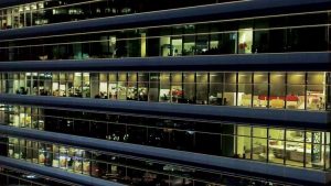
[1]Lighting in commercial buildings has long been governed by functional and economical standards and architectural considerations. The questions of how much light is required to make the space safe and functional, and how illumination can be delivered economically, constitute the basis for light source selection. This is also driven by stringent efficacy (i.e. energy savings) standards supporting sustainable architecture and design. For high-end spaces, a design concern may guide the choice of statement luminaires, or specialty light sources whose function is to highlight architectural elements.
A new paradigm, referred to as human-centric lighting, or lighting for human preference, where light is seen from the perspective of the users of a space is starting to emerge. The results of recent independent studies provide a foundation for designers to specify a spectrum humans prefer. This type of spectrum can help achieve more natural skin colors and warmer wood tones, increased vibrancy of objects, and a pleasant environment for building occupants.
New certifications such as the WELL Building Standard and recent test methods provide arguments for the use of higher quality light sources for the well-being of occupants, as well as the means to define the parameters of luminaires.
Greater efficiencies have continuously been achieved over the last 50 years. With the progression from incandescent light bulbs and fluorescent lamps to light-emitting diodes (LEDs) as primary illuminants employed in commercial spaces, it is time to shine the light on the humans who spend a large portion of their time in commercial buildings, and to select fixtures with the ability to contribute to their wellness.
Evolution of light sources
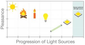 [2]
[2]Photos courtesy Focal Point
The sun was the first light source known to humans, followed by the discovery and control of fire, several hundreds of thousands of years ago. Candles and other similar sources of light were used until the invention of the Edison incandescent light bulb in 1879, less than a century-and-a-half ago.
Thomas Edison was not wrong when he said, “We will make electricity so cheap that only the rich will burn candles.”
Candles are not only impractical, but electrical light sources have also evolved way beyond the incandescent light bulb to provide increasingly powerful, reliable, economical, and efficient lighting over time.
However, the warmth and comfort associated with the sun, fire, and incandescent bulb is not found in light sources that have followed. Since the 1950s, luminaires have achieved better efficacy, but this gain corresponds to a drop in the perceived warmth and comfort of each type of fixture. During the 1970s, one got used to brightly lit spaces with a green glow typical of fluorescent lamps. This continued with the first LEDs that gained mass appeal in the early 2000s. It had been necessary, at that time, to tweak the spectrum by increasing the green content and reducing the red, so the LEDs would produce the maximum amount of light possible and make this new technology a viable replacement for fluorescent lamps.
This tradeoff is no longer necessary. Therefore, the discourse can shift from quantity to quality, and the resulting benefits of light sources matching human preference.
Measuring quality of light
Released in the 1960s, the color rendering index (CRI) is the most common measure for light color quality. It is only a measurement of fidelity, as it describes the accuracy of a light source to a reference illuminant (i.e. a blackbody radiator) on a scale up to 100. A score of 80 CRI is considered acceptable and has become a baseline for most light sources specified in commercial environments. Having said that, 90 CRI is the common specification point used today for high quality as it is more similar to the reference illuminant.
As explained, CRI is a single number, an easy-to-understand rule of thumb describing how a light source differs from a reference illuminant without describing the direction of change in either chroma or hue. In simple terms, chroma refers to the intensity or saturation of colors, while hue is the coloration. For example, not all reds are the same because some contain more blue tones while others have more red or yellow. Using CRI as a means to measure color quality may result in over- or under-saturated illuminants, possibly in different hues and resulting in distinct light qualities even though they have the same CRI.
In 2015, the Illuminating Engineering Society (IES) launched TM-30, IES Method for Evaluating Light Source Color Rendition, to provide an accurate description of LED light sources. An updated version (TM-30-18) was recently released.
 [3]
[3]Some of the key differences between CRI and TM-30 are the former uses eight color samples as reference. In addition to the limited color samples, all of the representative colors are pastel and do not properly represent a light source’s ability to render red. In response to this gap, a ninth color sample (i.e. red) called R9 was created. This R9 sample is sometimes referenced specifically in addition to CRI to provide some context on the red fidelity of a light source. On the other hand, TM-30 uses 99 color samples. These were scientifically chosen to represent millions of colors, and can also provide information on hue, chroma, and lightness for each sample. The same information—the spectral power distribution[4] of the light source (i.e. the representation of the power emitted by a light source at each or band of wavelength)—is used to derive the data for both CRI and TM-30. However, the latter provides a more detailed description of the light quality.
TM-30 conveys information relative to the primary parameters of color fidelity (Rf) and gamut (Rg), and it also provides a color vector graphic as a visual representation of the deviation between the gamut area of the light source compared to that of the blackbody radiator.
The color fidelity index measures the fidelity (i.e. accuracy) of a light source with a reference illuminant on a scale from zero to 100, making it very similar to CRI. For many of the blue-pump phosphor LEDs currently in production, Rf is very close to CRI with the former being slightly lower. However, with new technologies like narrowband phosphors and quantum dots, larger differences may be observed as the 99 color samples of TM-30 provide a fidelity reference across all rendered colors.
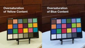
The gamut index signifies how much saturation a light source has. An undersaturated light source makes colors appear pale or whitewashed, while an oversaturated illuminant renders more vibrant colors. The gamut index is expressed with positive and negative numbers, providing a reference to the quantity of change as well as the direction of the change (if the source is over- or under-saturated), which is one of the limitations of CRI and the color fidelity index.
 [5]
[5]Information regarding local color fidelity and chroma and hue shift for all 16 hue bins was added to TM-30-18. The color spectrum of the light source is divided into 16 equal pie slices, allowing one to obtain specific information relative to the hue and chroma of each. Therefore, an oversaturation in the red spectrum or an undersaturation in the green spectrum can be identified. This updated technical memorandum is timely with light quality initiatives that are constantly growing in importance.
Quality of light initiatives
Some examples of quality of light initiatives actively being discussed in the industry include:
- circadian lighting – aims at improving sleep and mood by providing the right light spectrum for the time of day;
- warm dimming – replicates the quality of a halogen light source when an LED luminaire is dimmed down (this is commonly used in restaurants and other hospitality spaces where a warm and intimate ambiance is desirable, but often results in a warmer light and a color temperature inconsistent across the range);
- color tuning – often associated with circadian lighting but is a separate subset as it can also be used for preference without trying to align with and stimulate the human circadian cycle;
- spectral tuning – specialty lighting used in retail environments (e.g. the light spectrum of LEDs is tuned to create a specific effect, such as having the meat displayed in a meat locker appear as red and as fresh as possible, or for the clothing in a retail store to pop more); and
- human preference – providing a light quality humans prefer overall and that will, as a result, make them feel more comfortable and at ease in an environment.
Several recent studies that have converging conclusions support the human preference initiative and define a spectrum preferred by humans regardless of gender, age, or cultural background.
Research in human preference lighting
Independent studies conducted in North America and Asia draw similar conclusions as to what quality of light appeals most to human beings.
The Pacific Northwest National Laboratory (PNNL) published the first study in 2015 at about the same time IES released the TM-30 technical memoranum (Get more information on the research by reading, “Human perceptions of color rendition vary with average fidelity, average gamut, and gamut shape” by M. Royer, A. Wilkerson, M. Wei, K. Houser, and R. Davis, published in 2016 in Lighting Research & Technology). Observers were exposed to a space filled with recognizable branded objects, such as soda cans, fruits and other organic items, and clothing. A mirror was also present in the space so participants could observe their skin tone under different light conditions. The spectral power distribution of the light source was changed throughout the day.
The test was done in a manner similar to an eye examination, where participants were asked: “Do you like this, or that?” as light sources were modified throughout the test. They were exposed to high fidelities such as 100 CRI, and then it went down to 80, 70, and even 50 CRI, all at 3227 C (3500 K). The sources were also over- and under-saturated.
When the research team ran the results against statistical models, interesting trends emerged. They discovered the fidelity of the light source, contrary to common belief, had little correlation to preference. On the other hand, saturation, especially in the red spectrum, made a light source preferable. They defined preference with the following simple equation:
Preference = Fidelity + Red Saturation
The research team also recommended a fidelity greater than 74, and a red oversaturation between two and 16 percent, with an oversaturated gamut index.
 [6]
[6]Second came a study from Pennsylvania State University (PSU) employing a different methodology, but concluding with similar findings (Read “Models of color quality over a wide range of spectral power distributions” by T. Esposito and K. Houser, published in Lighting Research & Technology in 2018). Researchers conducted an absolute test as they outfitted a viewing area with common, colorful branded objects and organic items and showed participants one light source per day. This study was done at 3227 C (3500 K), and observers made judgments on many aspects of each light source, including preference.
Several spectrums—some with high fidelity and good gamut, others oversaturated, and the rest undersaturated—were tested. Although the format and methodology was different, preferred light sources fell in the same range as the PNNL study. Once again, the results did not show a strong correlation to fidelity but rather a robust connection to saturation.
Two more studies have since been published on the topic. PNNL did a follow-up study employing the same methodology but showing light sources in five different chromaticity groups, between 2427 C (2700 K) and 4027 C (4300 K), and found similar preference results consistent between the various color temperatures (Consult “Human Perceptions of Color Rendition at Different Chromaticities” by M. Royer, A. Wilkerson, and M. Wei, published in 2017 in Lighting Research & Technology).
The last study was conducted by researchers at Zhejiang University in China (For more information, read “Toward a unified model for predicting color quality of light sources” by F. Zhang, H. Xu, and H. Feng, published in 2017 in Applied Optics). They showed a total of 164 lighting scenes in four chromaticity groups, ranging from 2527 C (2800 K) to 6227 C (6500 K), and drew similar conclusions relative to preference. As the first study to take place outside of the United States, it also demonstrated preference is not conditioned by culture or the habitual built environment and transcends borders.
Defining a model for color preference
Using the parameters of TM-30 and the conclusions of the aforementioned studies, simulation spaces were set up in a private office in Chicago for several months in 2017 and 2018. While not scientific, this study allowed observers to spend extended periods of time under several preference models in their normal working environment. It also made it possible to collect feedback from visitors about three light sources, all falling within the spectrum defined by the PNNL, PSU, and Zhejiang studies.
The three preference models tested modulated the red saturation, hue bins one and 16, between –1 and 14 percent, while maintaining an oversaturated gamut index (Rg) of 103 to 110. Conversely, the color fidelity index (Rf) went down from 92 to 83 because Rg and red saturation increased as the light source was deviating more and more from the blackbody radiator.
The middle target, with the following parameters, was ultimately preferred:
- Rf = 91;
- Rg = 107;
- Hue bin one = four percent; and
- Hue bin 16 = seven percent.
While it has a fidelity index of 91, very close to CRI 90, the latter would fall short of a preferred light source. It is important to note a preferred light source needs to not only have fidelity to the reference illuminant, but also be oversaturated (Rg 107), specifically in the red content—hue bins one and 16. This is why TM-30 is superior to CRI because it takes more parameters into consideration to more precisely describe a light source. The additional parameters provided by TM-30 allows one to specify how this fidelity index is actually achieved: With an oversaturation of red of four and seven percent, respectively in hue bins one and 16, and resulting in an overall gamut index of 107, indicating an oversaturation of the light source by seven percent.
This preferred spectrum gives skin tones a more natural look by adding a little red content. It also enhances organic elements and wood tones, giving them a warmer coloration, and it makes brightly colored items, whether a fruit, vegetable, or manmade, appear more vibrant.
Preference for red
Anthropological, historical, and sociological factors appear to explain the preference for a light source with a slight oversaturation in the red spectrum. Humans have evolved for hundreds of thousands of years around fire, which would have shaped their perception of a preferable light source.
According to research performed by Andrew J. Elliot and Markus A. Maier, “color can carry meaning and have an important influence on affect, cognition, and behavior in achievement and affiliation/attraction contexts. Red, especially, has been shown to be a critical color in this regard,” (Read “Color Psychology: Effects of Perceiving Color on Psychological Functioning in Humans” by Andrew J. Elliot and Markus A. Maier, published in June 2013 in the Annual Review Psychology).
When considering the use of red—stop signs, fire alarms, medical symbols, and colloquialisms such as “roll out the red carpet”—it is unsurprising the color can evoke emotion. Studies have shown sports teams wearing red jerseys win more often and women wearing red are ‘perceived as more attractive’ by men (Read “Romantic Red: Red Enhances Men’s Attraction to Women” by Andrew J. Elliot and Daniela Niesta for the Journal of Personality and Social Psychology [2008]).
A team from the Georgia Institute of Technology (Georgia Tech) and Yahoo Labs conducted a study analyzing more than seven million images on a photo website, about half of which originated on a social media platform (The research paper, “Why We Filter Our Photos and How It Impacts Engagement,” by S. Bakhshi, E. Gilbert, L. Kennedy, and D.A. Shamma was presented at the ninth Advancement of Artificial Intelligence AAAI Conference on Web and Social Media in 2015). They were looking to understand how people employ app filters on photos and how it impacts engagement on social media. The research revealed filtered photos had greater engagement than unfiltered images.
Further, filters that altered images to increase the contrast or exposure and skew them to appear warmer in color with more intense reds and yellows resulted in slightly higher engagement. The desire for intense colors seems to have followed humans all the way from the cave to the connected world.
Quality over efficacy
While LEDs have achieved tremendous gains in efficacy as they became widely adopted in the early 2000s, those gains have slowed to the rate of roughly 10 percent per year. With light sources achieving never-before-seen efficacy levels, ranging between 100 and 140 lumens per watt (LPW), which is the amount of light emitted per watt of energy consumed, what is the impact of modulating the spectrum to achieve a better light quality?
Compared to 80 CRI LEDs, preferred light sources with their higher red content result in a slight loss in efficacy as well as an increase in energy cost amounting to cents per luminaire per year. However, preferential spectrums existing today translate to lower costs than the best fluorescent ever achieved, or 80 CRI LEDs, from five years ago.
Maybe it is time to weigh the benefits in terms of well-being and pleasance provided by the preferred spectrum against the slight efficacy loss, and to start looking at lighting from the perspective of those who live, work, heal, learn, and play under those light sources every day.
- [Image]: https://www.constructionspecifier.com/wp-content/uploads/2019/08/bigstock-Singapore-September-277446820.jpg
- [Image]: https://www.constructionspecifier.com/wp-content/uploads/2019/08/FP-Pleasance-Graph-4.jpg
- [Image]: https://www.constructionspecifier.com/wp-content/uploads/2019/08/FP-PreferenceSpectrum-Vignette-wood-tone.jpg
- spectral power distribution: http://www.lrc.rpi.edu/education/learning/terminology/spectralpowerdistribution.asp
- [Image]: https://www.constructionspecifier.com/wp-content/uploads/2019/08/FP-PreferenceSpectrum-wood-tone.jpg
- [Image]: https://www.constructionspecifier.com/wp-content/uploads/2019/08/FP-ColorChart-oversaturation.jpg
- matthew.blakeley@focalpointlights.com: mailto:matthew.blakeley@focalpointlights.com
Source URL: https://www.constructionspecifier.com/advancing-the-quality-of-light/