Colors of well-being: Acoustic ceiling color trends and specification
by brittney_cutler | November 3, 2021 8:21 am
 [1]
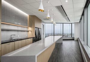
[1]Colorful ceilings add to a room’s sense of comfort and health. Color[2] helps people feel more connected to themselves, to those around them, and to their surrounding environment. People who feel connected are also happier, more satisfied, and have a greater sense of well-being.
Beyond the modern monolithic look of smooth, white, square panel, drop ceilings, today’s interior ceiling design ideas explore many different styles from bold accents to subtle shades to a signature, custom creation. Choosing colors should be a conscious, specified design decision selected with purpose, function, and meaning.
As the ‘fifth wall’ of a room, the ceiling presents an opportunity to strategically add color, while optimizing acoustics, improving indoor air quality (IAQ), lowering maintenance, and meeting other specified performance attributes.
Color influence and impact
Color plays a vital role in enhancing the architectural form of a room and in influencing a person’s experience inside it. It can spark creativity, increase productivity, or make a room seem bigger or smaller. Color conveys the mood, function, and atmosphere of a room, and assists with navigation through a building or campus.
Subconsciously, color is the first feature people notice on an object or in a space. It immediately prompts a sense of comfort or wariness. It evokes an emotion and signals a purpose. Instinctually, humans and animals are cautious when encountering bright colors in nature. This biological reaction stems from an evolutionary warning system that helps protect against poisonous insects, snakes, plants, and other dangerous creatures or food sources.
On a biological level, greens are reassuring. Where there is green, life-sustaining food and water can be found. Green falls in the middle of the color spectrum and the eye requires little adjustment to see it. This makes it a restful color, indicative of balance and harmony. Some designers choose greens as representative of the balance between mind, body, and emotional self. Interiors using green can help people to relax and thrive.
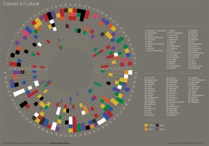
Red carries numerous meanings, even in the same culture[3]. For example, in African cultures, it can indicate good luck or anger. Similarly, in North America, it can mean anger, danger, courage, desire, heat, or love. Red has been shown to have a physical effect on people, raising the heart rate, which can make one flush, and can activate the fight or flight instinct that occurs in response to a perceived threat. The increased pulse and alertness also can make it feel as if time is passing more quickly. Interiors typically use red colors as an accent feature, rather than across an entire room.
Beige and brown colors also promote a feeling of relaxation, comfort, and safety, where people want to linger. These earth tones are solid, dependable, and grounded, like a tree. A serious, but softer option to a midnight black, brown, and beige shades are associated with supportive, cozy, and warm environments.
 [4]
[4]Color in history
Since ancient times, color’s symbolic and ritualistic meaning has been recognized by artists and architects who have tapped its power to evoke emotion, influence perception, and affect behavior. When and where people live shape their perception of the world and this includes their cultural interpretations of color.
During the Roman Empire, purple was reserved for royalty and forbidden for common use. The Western European connotation of purple as a ‘royal’ color associated with virtue, flamboyance, and mystery has remained for millennia after the reason faded from memory. In Japanese and Hindu cultures, purple is representative of wisdom. In First Nation and Indigenous cultures, purple is the color of gratitude.
Purple is the color of mourning in many South American cultures. In North America, mourners dress in black clothes whereas in China they would wear white. Silver tones would be associated with death in Arabic cultures.
In Western European and North American cultures, yellow generally is associated with happiness, joy, and sunshine. It has a relatively long wavelength and is emotionally stimulating. People in rooms with yellow tones often feel more confident, positive, optimistic, and rejuvenated.
Most of the world’s population will pick blue as a favorite color. In addition to being globally preferred, blue is the color most people ascribe to both sky and sea. Lighter tones are credited to mental calmness, serenity, and reflection. For interior designs, blue’s attributes include improved concentration and clarity.
Color trend collections
The fashion, automotive, housewares, and building products industries are among the many businesses investing in predictive forecasts to determine what the next global color trends will be. For commercial interior spaces, four main color trends, motivations, and palettes have been identified:
Biophilic awareness
Biophilic awareness emphasizes the relationship with the natural world. Daylight, outside views, indoor plants, water features, natural materials, and naturally inspired colors and finishes are some of the design elements that can help make the indoors feel more like the outdoors. Ceiling designs inspired by biophilic awareness will favor curves and organic shapes, wood and wood-look finishes, and colors reminiscent of plant and ocean life ranging from seaweed and eucalyptus greens to storm and azure blues.
Wabi-sabi
The traditional, Japanese aesthetics, wabi-sabi appreciates the beauty of imperfection, impermanence, and incompleteness. It accepts the transient nature of the physical world and celebrates the authentic character and serenity gained with time. Modern adaptations also apply this concept to human-made objects imbued with understated elegance and visible signs of age, wear, or repair. Asymmetrical and natural forms with smooth edges and surfaces depict wabi-sabi in earth tones of clay, cork, chalk, hemp, stone, or wood and copper finishes. The uncluttered wabi-sabi trend works well as an interior design strategy for places of healing, learning, and meditating. It is ideal for spaces where people are encouraged to take care of themselves and each other, rediscover lost skills, reclaim natural resources, and contemplate their future.
Technology
When the future is uncertain and choices are limited, the technology-inspired trend acknowledges distractions can also be therapeutic. A new digital layer is merging human and artificial intelligence (AI) to define and combine the places where people live, eat, heal, learn, shop, work, and play. The user’s experiences are becoming synonymous with the user’s identity. Metallic, manufactured, and molded materials in sharp angles, crisp edges, and precise radial arches represent this trend in chromatic blue, dark gray, and elemental tones of mercury, zinc, and iron.
Calm enclosure
Despite its name, the calm enclosure trend is not a subdued style. It celebrates spaces and colors empowering people to find their inner peace and giving them the courage to outwardly express themselves. Energizing, playful, and surprising, this palette embraces mustard yellows, deep scarlets, powdered corals, and seashell pinks, matched with rounded, wavy shapes and powdered, velvety textures. The calm enclosure trend is well suited for spaces that promote communication, collaboration, creativity, connection, and compassion.
 [5]
[5]Color perception, light reflectance, and consistency
The material, lighting, and shape of an object or a space can change the human eye’s perception of color. Isaac Newton’s scientific studies in the 1660s demonstrated color is the reflection and absorption of light; lighter colors reflect more light and darker colors absorb more.
Ceiling designs frequently specify a smooth, white surface with high light reflectance (LR) to maximize the use of natural light, while more efficiently using electric lighting, and diffusing the light for a more comfortable and productive occupant experience. For example, an office with a bright white ceiling panel may be specified with a 0.86 LR, indicating that 86 percent of light will be reflected from its surface.
For spaces where very low LR is preferred, such as in a theater, internet cafe, or electronic gaming center, a dark black ceiling panel may be specified with a 0.04 LR. Every color of ceiling panel has its own LR value.
At Akamai Technologies new global headquarters in Cambridge, Massachusetts, black ceiling panels were placed in the presentation room to enhance audio-visual experience. White ceilings above the open workstations and in the corridors have an 0.85 LR, a Hemp color panel with a 0.45 LR was used for the huddle rooms and private offices, and Stone color ceiling panels with a 0.55 LR were designated to the boardroom.
While it may go unnoticed, the human eye perceives color as changing with the light source and its position, the time of day, and the time of year. Color will look different in the morning than in the afternoon, in the spring than during fall, in a south-facing versus a north-facing room, and inside a room versus on a building’s exterior.
Different materials and shapes also change the way a color appears. Almost everyone has discussed whether a particular ‘off-white’ has more pink, yellow, or green. Depending on whether a surface is made of stone wool, metal, or wood, or whether it is curved, angled or flat, the viewer may perceive the same color as a lighter or darker tone, or even with a different hue.
Before specifying multiple ceiling products in a space, request samples from the manufacturer to examine the finished materials side by side under the same conditions the owner and occupant will see them. This is especially important when considering a mix of materials and manufacturers. Most commonly, designers will want to match the ceiling panels with the suspension systems, acoustic baffles or ceiling clouds, or a decorative accent piece such as a curved metal ceiling feature. A single source supplier will have more control in maintaining color consistency.
Regardless of the ceiling product or material, be aware of which surfaces are visible and are included as part of the standard finish. Ask the questions:
• Are the edges the same color as the surface?
• If the installing contractor makes a cut in the field, will touch-up paint be needed?
• Will a 360-degree finish be applied if the ceiling system
is designed for an open plenum, with various curves and angles, or visible from an upper level?
• If the ceiling is low and within reach, will lighter color panels need to withstand more regular and rigorous cleaning?
• If the ceiling is higher than 3 m (10 ft), how noticeable will the color be to those at floor level?
Color supporting acoustical performance
Vibrant colors used on ceilings in rooms with high sound reflectance can enliven the senses and energize a space. Accents of red, yellow, and blue, primary colors stimulate the brain, such as in a middle school’s cafeteria, a boutique retail shop, an office breakroom, or a fitness center.
Organic colors and natural finish patterns also can be matched with sound-absorbing ceiling designs to make institutional spaces feel more like hospitality. Consider wood grain finishes on the ceiling of a medical clinic’s waiting room or charcoal color panels to emulate a night sky in a university’s reading room.
Ceilings combining high sound absorption with soothing shades of soft brown, light pink, powder blue, mint green, and pale yellow immerse visitors in quiet, calming spaces. This visual and acoustic pairing can be critical for rooms designed to alleviate stress and promote well-being. Key examples include rooms for parents to feed nursing babies, or neurodiversity sensory rooms providing a safe place for people to reduce anxiety.
An optimal acoustic experience supports people’s wellness and productivity in all interior spaces. As part of the room’s design and material selection, remember to specify a ceiling panel with a noise reduction co-efficient (NRC) appropriate to the space. In a classroom full of students, a restaurant packed with diners, or an open office with busy employees, ceiling panels with high NRC ratings—0.90 and higher—are needed. This sound absorption increases speech intelligibility by decreasing reverberation. Even in quieter spaces, such as private offices or patient rooms, ceiling sound absorption is essential for speech privacy and intelligibility.
Many types of buildings and rooms must now comply with more high acoustic absorption criteria in North American standards, guidelines, and rating systems, including:
• The Facilities Guidelines Institute (FGI), which prescribes the design and construction of healthcare facilities, requires “all normally occupied healthcare facility spaces shall incorporate acoustic surfaces.”;
• The WELL Building Standard, typically used for commercial office buildings, requires “sound reducing surfaces” for the health of the cardiovascular, endocrine, and nervous systems of building occupants; and
• The Collaborative for High Performance Schools (CHPS) emphasizes “student learning suffers in acoustically poor environments,” where “excessive noise and long sound reverberation negatively affect speech communication.”
These and other building guidelines, like the Canadian and U.S. Green Building Councils’ Leadership in Energy and Environmental Design (LEED) certification programs, recognize the opportunity for materials and products to contribute to the safety, health, and wellness of people and their surrounding environments.
As buildings re-open in the post-pandemic era, owners and occupants share an increased concern for IAQ. Specifying ceiling systems meeting Underwriters Laboratories (UL) Environment’s GreenGuard Gold certification for low-emitting products will fulfill criteria for LEED, WELL, Collaborative for High-performance Schools’ (CHPS’) certification, and other programs.
Further supporting IAQ and healthy building goals, stone wool and metal are not organic and, therefore, do not provide sustenance to mold, mildew, bacteria, fungi, and other microorganisms. Ceilings composed of organic fibers and water-based materials must add a biocide, fungicide, or antimicrobial to help protect against mold and mildew. With the added chemicals, these materials may become a potential pollutant contributing to poor IAQ.
Regardless of their colorful finish, stone wool and metal ceilings also do not absorb water, moisture, or humidity, are sag-resistant, and are easy to clean without harsh chemicals. In general, ceilings should require minimal cleaning.
In specialized applications—such as cleanroom applications, or in healthcare and wellness centers requiring infection control—color choice is more limited. Classic white ceilings convey a sterile environment and should be specified to meet the room’s unique conditions. For example, ceiling panels in Bacteriological Class B1 and B5 applications may need an air-tight backing membrane, sealed edges, and be able to withstand rigorous disinfection more frequently.
Additional performance considerations for ceiling materials include:
• resistance to heat, flame spread, and smoke spread;
• durability and longevity, reducing the need for repair or replacement; and
• recycled content and recyclability at the end of its useful life.
With a nearly limitless palette of colors for acoustic ceiling panels and suspension systems, designers and specifiers have the power to create interior spaces that motivate, calm, comfort, and inspire. Working closely with the ceiling manufacturer, project teams ensure the selected system appears and functions as specified to support the building owner’s long-term value and the occupants’ lifelong health and well-being.
 Diana Hart, CSI, IIDA, serves as manager of architectural sales and business development for Rockfon North America, part of the ROCKWOOL Group. Working with architects, designers, and specifiers, she helps in selecting advanced acoustic ceilings and wall solutions to create beautiful, comfortable spaces. She can be reached at diana.hart@rockfon.com.
- [Image]: https://www.constructionspecifier.com/wp-content/uploads/2021/11/Rockfon_MA-Akamai74-AntonGrassl.jpg
- Color: http://rockfoncolors.com.
- culture: http://www.informationisbeautiful.net/visualizations/colors-in-cultures.
- [Image]: https://www.constructionspecifier.com/wp-content/uploads/2021/11/3_Rockfon_Color-all_7762.jpg
- [Image]: https://www.constructionspecifier.com/wp-content/uploads/2021/11/2_ColoursInCulture_2.jpg
Source URL: https://www.constructionspecifier.com/colors-of-well-being-acoustic-ceiling-color-trends-and-specification/