Illuminating design for the visually impaired
by Katie Daniel | January 4, 2018 3:30 pm
 [1]
[1]by Mark Cavagnero, FAIA, and Katy Hawkins, LEED AP
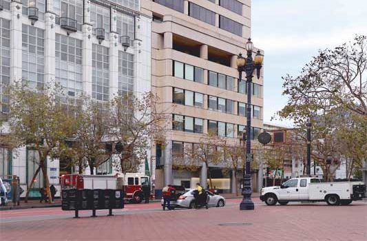
San Francisco’s LightHouse for the Blind and Visually Impaired is a 115-year-old social services organization serving people who are blind or have low vision.
In designing the organization’s new headquarters, the architects at Mark Cavagnero Associates had the opportunity to reimagine their usual design process and rethink how to create beautiful spaces focusing on all senses. The team worked closely with LightHouse CEO Bryan Bashin, who challenged the team to think beyond sight and create a warm, uplifting space.
The mission of the LightHouse is to:
- provide training for people at all stages of vision loss;
- create a strong community within the organization; and
- forge connections with other organizations and companies.
Clients who come to the LightHouse at what is often a very stressful time in their lives learn loss of vision is not loss of quality of life, but rather the beginning of a new way of experiencing and participating in the world around them.
Designing this unique building required the designers to think about architecture in new, creative ways. From planning to execution, project team members with decades of experience had to learn new skills and reimagine old ones. Fresh approaches were required to meet very specific challenges. The project required particularly close, detailed attention to acoustics, lighting, and textures.
More than in any previous project, Mark Cavagnero Associates had to visualize, test, and prototype how the smallest details within spaces would be used and lived in by its eventual occupants. In place of standard, two-dimensional conceptual drawings, tactile prints were used. The architects had to find the proper drawing scale and format the tactile prints to be easily read with the fingertips. At the outset, just as the LightHouse provides training to their clients on blindness skills, it also trained the design team on effective nonvisual communication techniques, including formatting of tactile drawings for maximum clarity. The team was also fortunate to draw on the expertise of architect Chris Downey, president of the LightHouse board, who is blind.
The 4180-m2 (45,000-sf) facility takes up the top three floors of an office building on Market Street. Staff offices are on the ninth floor, with the main reception area and other public spaces on the 10th. The 11th floor houses short-term residential facilities.
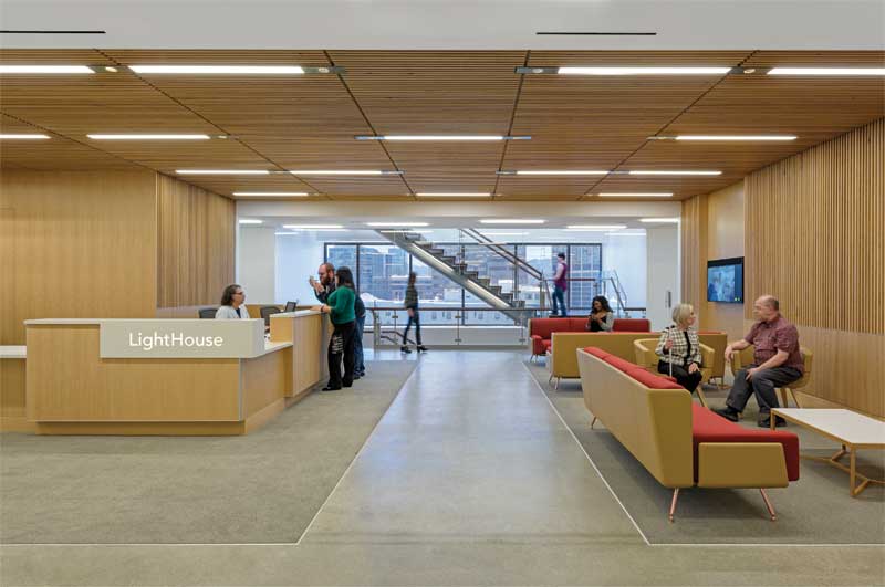
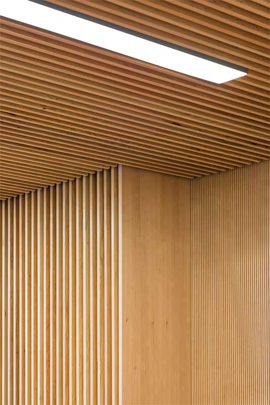
One key goal of the project was to create a comforting first impression as occupants walk off the elevator and into the 10th-floor reception area. Wooden slats were used for the walls. As well as being aesthetically pleasing, the spaces between the slats allow sound to pass through, to the absorptive surface behind, thereby creating soothing acoustics.
This space had to be both acoustically and visually warm. Several strategies were employed, and different senses harnessed to create this effect. Wayfinding was one of the most important design challenges addressed by the architects.
 [2]
[2]Photos © Jasper Sanidad
Intuitive wayfinding
Working closely with the client, the architects came up with a spatial and material solution to make wayfinding intuitive for blind and low-vision users, many of whom may be new to blindness. The spaces on each floor are arranged around a circulation ring, with a public gathering/lounge space in the center linking the existing elevator lobby and the new interconnecting stair. The flooring of the ring was discussed at length, as different materials have very different effects on the sound of cane taps.
One misconception about cane-users is the idea they employ the cane to feel directly in front of them. While this is partly true, the primary purpose of the white cane is to produce the sharp tapping sound, which enables users to visualize their surroundings through echolocation. After trying out several different materials, including carpeting (which provided no cane feedback) and bamboo flooring (which carried too much of a ‘plastic’ sound), it was determined polished concrete gave the most pleasing and useful sound for aural cane feedback.
At one end of the floor, colorful light-emitting diode (LED) panels on the walls serve as part of the wayfinding strategy. Approximately 90 percent of visually impaired people have some vision, and vivid color is something people with low vision can often discern. The client also wanted the panels to be interactive, so there are sliders for users to mix their own colors and change the mood of the space, as well as various presets, such as orange for Giants games or red and green for Christmas.
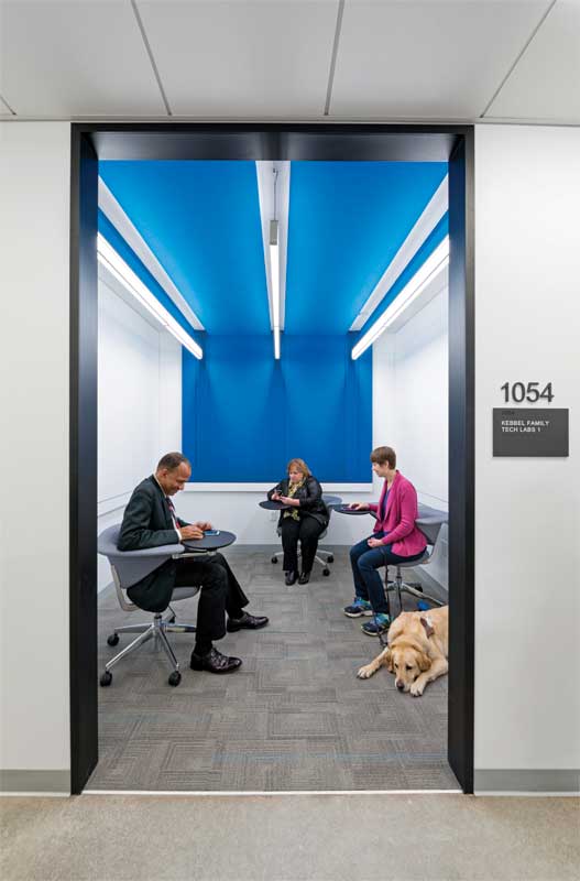
Signage is another important component of the wayfinding strategy. Oversized, three-dimensional room numbers were used, separated from the body of the sign and contrasting with the background to make them easier to read for those with low vision. The body of the sign has a smaller, code-conforming raised room number, the same color as the sign so it does not appear as a visual duplicate.
Glass office doors will often have signage mounted directly on the glass, which sometimes means it is difficult for low-vision users to read. To address this, the architects mounted a 305-mm (12-in.) wide wood band at the strike side of each door, providing a solid surface for room signage. On the other side of the wood band, inside the room, users can expect to find light switches and room controls, as well as hooks for hanging canes.
 [3]
[3]Lighting
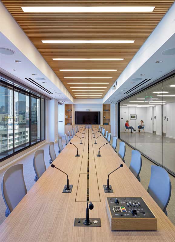
Lighting was a very important aspect of the design for the new LightHouse space. The right type of lighting is crucial to utilizing the remaining sight of the visually impaired. There are many types of vision loss, and many (but not all) people with low vision need very high light levels to make the most of their visual acuity. Low-vision users need a comfortable environment with soft, low-glare lighting.
Lighting consultants at Auerbach Glasow researched recommended light levels for the visually impaired to use as a starting point in the project. American Society of Heating, Refrigerating, and Air-conditioning Engineers/Illuminating Engineering Society (ASHRAE/IES) 90.1, Energy Standard for Buildings Except Low-rise Residential Buildings, allows a higher-than-typical lighting density for the visually impaired, but surprisingly, these light levels apply to spaces “in a facility for the visually impaired (and not used primarily by the staff).” At the LightHouse, the majority of the staff are also visually impaired, but this code excludes them. While certainly well-intentioned, it nonetheless perpetuates the assumption blind and low-vision people are not active participants in the workforce.
In California, light levels are often limited by the stringent wattage limits in the California Energy Code (California Code of Regulations, Title 24, Part 6). Initially, Auerbach Glasow designed the project to maximize light levels while staying within the wattage limits. This design was then vetted with LightHouse low-vision staff in an extensive lighting mockup, where all 28 fixture types in the project were set up for users to review. The results of the mockup revealed a code-compliant approach would not lead to a visually accessible space for low-vision staff and clients. The code-compliant design maximized brightness, but to minimize wattage, each individual fixture had a higher level of brightness at the lens. The mockup participants noted that this caused uncomfortable amounts of glare for those users with low vision.
It was clear the team needed to redesign the lighting in a way that was user-compliant rather than code-compliant. Given so many of the staff at the LightHouse are blind or have low vision, this was truly a matter of creating an equitable and accessible workspace, which is mandated by the Americans with Disabilities Act (ADA). Working closely with plan examiners and advocates in the San Francisco Mayor’s Office on Disability, the LightHouse applied for a disabled-access accommodation allowing the project to be exempted from the wattage limits imposed by Title 24. The project was still required to meet all other energy code requirements, such as stepped dimming in daylight zones, occupancy sensors, and full dimming capability throughout. The resulting design allows the space to be very bright, while keeping a lower level of brightness at each fixture to control glare. Comparing the code-compliant version with the final version, it was calculated this design incorporates 25 percent more fixtures and wattage in circulation areas, with 50 percent more in offices.
 [4]
[4]Acoustics
Another common misconception is the idea as one sense is lost, others become stronger. People who are blind or have low vision are sometimes thought of as having better hearing, but this is a myth. Rather, blind people are often better listeners who focus more on sound in the absence of visual distractions.
Bashin challenged the design team to create a space emphasizing the right types of sound. Rather than absorbing or blocking out all sound, he wanted the space to be warm and lively. Some of this was achieved through architectural moves—for instance, the polished concrete circulation ring enables people to hear others’ cane taps and the click of guide dogs’ toenails, and the new grand stair was designed to be as open as possible. It allows sounds to travel from one floor to another so occupants have a sense of activities happening elsewhere in the space. Other aspects required deeper analysis. The architects worked with acoustic designers at Arup, who created three-dimensional acoustic models of key spaces in the LightHouse to test them out prior to construction.
During the testing process, the LightHouse stakeholders sat in a spherical array of speakers and listened to the effects of iterative changes in room surfaces for acoustic control within a space, as well as acoustic separation between spaces to block out unwanted noise. They assessed the finishes in the reception area and determined what was the most comfortable ratio of absorptive surfaces for sound control and reflective surfaces for liveliness.
The study showed secondary acoustic windows were needed in important spaces along the Market Street façade to keep noise from streetcars from disrupting activities in the boardroom and multipurpose room. It was also determined a higher degree of acoustic separation was necessary between private offices so office occupants would not hear their neighbors, meaning partitions with
a noise isolation class (NIC) of 42 were specified. At the office front, however, too much sound separation would have led to an office occupant not knowing about activities happening outside, so a lower NIC of 30 was specified. The 9.5-mm (3/8-in.) laminated glass and acoustic door seals achieve this NIC 30 performance, reduce distracting noises, and allow a sense of activity and liveliness to pass through.
 [5]
[5]Finishes
When selecting finishes, the team considered the tactile quality of surfaces. Wherever appealing or interesting finishes were used on the ceiling, they were also wrapped down the walls so they could be felt, if not seen. Wood-slat ceiling finishes were specified in major spaces to create a sense of warmth while providing needed acoustical control. These were also wrapped down the walls, and provided with eased corners to make them pleasant to touch. High-contrast materials were specified throughout for maximum discernment by low-vision users. Many with low vision can see some color, and rich, saturated jewel tones are most easily discerned. Therefore, in small training rooms, bright and bold-colored felt acoustical panels were used on ceilings and walls to provide strong sound control with a fun look and feel.
Circulation stair
The heart and spine of the project is the new stair, which connects the three floors of the LightHouse. The desire was for a sense of connection between the three floors. A walled-off stair, even one behind glass, was not appropriate because it would not allow sound to move between the floors.
The LightHouse team wanted to ensure sound would flow between the floors, so users have a sense of activity above and below. The stair also has numerous features that were tested and mocked up in advance, including acoustics.
When taking the stairs, one rarely thinks about the feel of the handrail, but this component received special thought and attention. Made of Brazilian softwood, the detailing makes the handrail visually beautiful. It is lightweight and structurally expressive, but its beauty had to translate to those unable to see it. This entailed creating a set of 3D-printed mockups of various handrail profiles.
Here, Chris Downey’s collaboration was instrumental. Working with Downey, the team came up with an ergonomically pleasing shape that fits the hand. It is not a typical round handrail profile—the top of the rail is a rounded half-ellipse for the fingers to wrap around, and underneath is a slightly concave groove, providing the thumb a comfortable resting place as it slides along the rail. This allows the hand to rest in a natural position. Such attention to craft means the detail of the stair can be felt as well as seen; it is another example of not biasing the design toward sighted users. This is part of what Downey termed the “non-visual aesthetic” of the space.
 [6]
[6]Another subtle feature of the stair is the nosing on its treads. The California Building Code (California Code of Regulations, Title 24, Part 2) requires a contrasting strip on only the top and bottom nosings of a stair run, but for low-vision users, it is more helpful to have these strips on every step, and to make them wider. Additionally, different stairs have different reflective properties—the top and bottom stairs have a satin finish, giving them a higher contrast with their nosing, while the middle ones are matte, and thus are lower in contrast.
The nosing itself is also specially designed. Initially, the architects chose a standard off-the-shelf grooved aluminum bar for the nosing profile, but when Downey and Bashin tested it with their canes, they found the tip of the cane caught on the grooves, which was not only uncomfortable, but also potentially dangerous. To solve this problem, the designers made another series of 3D prints, to determine the optimal groove width, depth, and spacing for cane-users. The resulting profile has shallow, narrow grooves to avoid catching cane tips while still providing slip resistance.
Looking back and looking forward
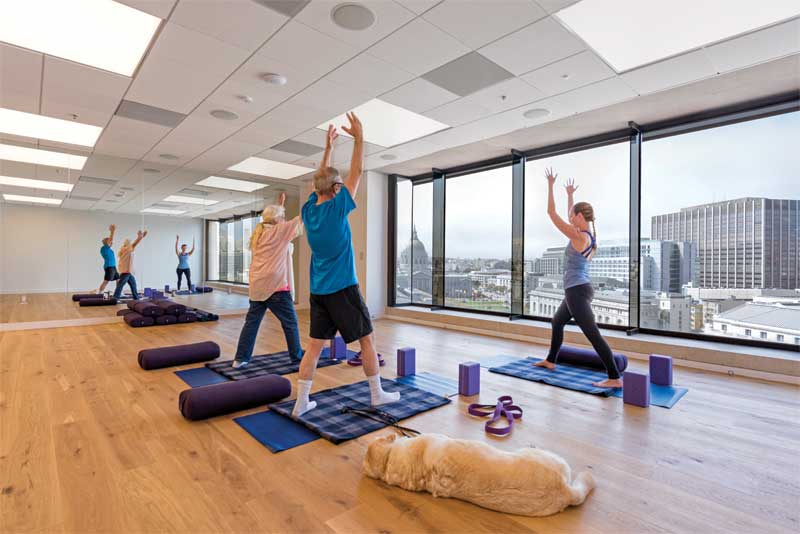
Now that the LightHouse has been in its new home for just over a year, the organization has reported back to the architects that the space is just what was hoped for: bright, lively, and adaptable to accommodate users with varying degrees of visual acuity. The LightHouse has hosted a variety of events, including immersive training sessions in the top-floor dorms, blind cooking classes in the two teaching kitchens, and meetings with representatives from area tech companies working on making apps accessible to the blind.
This project was truly a unique opportunity for the architects at Mark Cavagnero Associates, and there are many aspects they plan on carrying forward in their practice. The design team sees value in approaching future projects with particular attention to color and contrast, wayfinding, and making comfortable environments through thoughtful consideration of lighting and acoustics. True to the principles of universal design, making a space accessible and functional for those with disabilities allows it to function better for all the occupants.
Mark Cavagnero, FAIA, is founding principal at Mark Cavagnero Associates. His architectural work includes a broad range of renovation and new construction work for cultural, civic, and institutional clients. Cavagnero’s 30-year career, which began in the New York office of Edward Larrabee Barnes/John M.Y. Lee Architects, continues the tradition of Modernism in the United States. He founded Mark Cavagnero Associates in 1993, and has guided its growth into a design-centered practice serving clients internationally. Cavagnero can be reached via e-mail at markc@cavagnero.com[7].
Katy Hawkins, LEED AP, has been practicing architecture in San Francisco for 12 years, following four years working as a structural engineer. She has been a project manager at Mark Cavagnero Associates since 2014, working on tenant improvement and new construction projects for nonprofit organizations such as the LightHouse for the Blind and Visually Impaired and the Monterey Bay Aquarium. Hawkins can be reached via e-mail at katyh@cavagnero.com[8].
- [Image]: https://www.constructionspecifier.com/wp-content/uploads/2018/01/VIEW_1-2-e1515096703812.jpg
- [Image]: https://www.constructionspecifier.com/wp-content/uploads/2018/01/cavagnero-lighthouseblind-8538-Rev.jpg
- [Image]: https://www.constructionspecifier.com/wp-content/uploads/2018/01/cavagnero-lighthouse2-3057_rev.jpg
- [Image]: https://www.constructionspecifier.com/wp-content/uploads/2018/01/cavagnero-lighthouse2-2995_rev.jpg
- [Image]: https://www.constructionspecifier.com/wp-content/uploads/2018/01/cavagnero-lighthouseblind-8513c.jpg
- [Image]: https://www.constructionspecifier.com/wp-content/uploads/2018/01/cavagnero-lighthouse2-2892_rev.jpg
- markc@cavagnero.com: mailto:markc@cavagnero.com
- katyh@cavagnero.com: mailto:katyh@cavagnero.com
Source URL: https://www.constructionspecifier.com/illuminating-design-visually-impaired/