

By Peter Krech
Two projects in the Greater Seattle area with an integrated approach to facade design were recently completed by Graphite Design Group. This approach utilizes a pre-engineered, high-performance curtain wall system as a chassis while employing distinctive, bespoke elements on the exterior that are unique to each project to reinforce underlying design concepts.
Through close collaboration with the client, contractor, and envelope supplier, a high degree of customization was possible while simultaneously managing cost and ensuring constructability, longevity, and performance.
Nitro
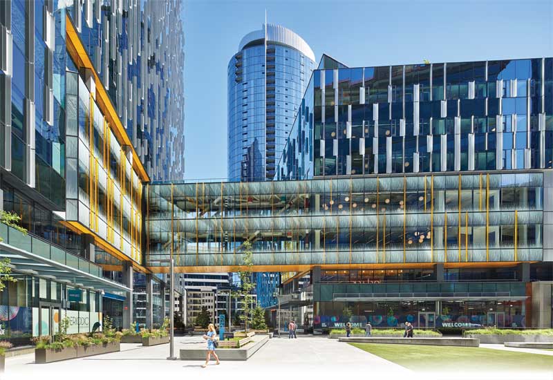
Nitro is comprised of two towers occupying a full city block in Seattle, Wash. The north tower—Nitro North—is 24 stories, with ground floor retail, amenities on levels two to five, with workplace floors above. Nitro South is also anchored by ground-floor retail. Levels two to eight are shared, with a portion of each level occupied by Amazon and a portion occupied by Mary’s Place Family Center. Part of Amazon’s Denny Regrade campus, the project was the fourth block of a campus eventually comprised of nine buildings. The towers are linked by a two-level sky bridge, allowing Amazon employees convenient access to shared spaces between both towers.
Design concept
The design of the towers sought to emphasize the composition of the two-building ensemble on the block, provide continuity with adjacent Amazon campus buildings, and employ an evocative, dynamic cladding language that shifts in appearance as one moves around and through the block, viewing the building from different vantage points. Just as the sky and surrounding environment reflected in the facade changes throughout the day and seasons, so does the building, presenting a constantly changing pattern language.
To achieve the expressive cladding language, a pattern of birds in flight—specifically a murmuration of starlings—was abstracted, pixelated, and projected over the entirety of the facades as an underlying organizational element. Seemingly abstract, this pattern changes in rhythm and density as it moves across the surface of the building’s skin.
Material selection
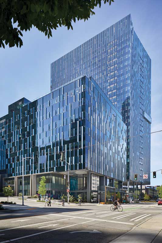
The curtain wall used is a unitized system like that used in neighboring campus buildings, employing a graphite gray color for the aluminum framing elements and operable windows that blend harmoniously with the glazing. All tower facades are cloaked in this same system to emphasize the shapes of the towers that bend and fold in response to site influences and contextual relationships.
At the sky bridge linking the towers, full-height clear glass with a custom frit pattern is employed to emphasize the linkage between the structures and provide visibility to the activity within. Translucent, amber-colored glass fins also highlight the bridge, catching sunlight and projecting a subtle color to the interior space.
Focal element
While the underlying curtain wall system is largely conventional to match the aesthetic and performance of the balance of the Amazon Regrade campus buildings, the exterior expression is wholly unique.
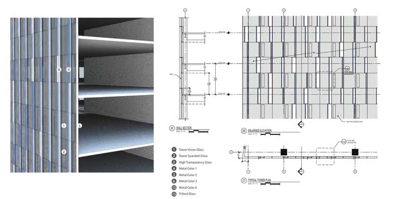
The design team worked with Walters & Wolf (W&W) to develop the building envelope, employing three different projecting fin profiles and four different colors (silver and three shades of blue), each of which is interchangeable within the underlying system. The fins may be oriented either left or right on each unitized panel, which themselves can have different fin profiles and colors in the vision and spandrel zones, doubling the number of potential variants.
The result is a customizable system, with thousands of different panel combinations possible as individual elements are “tuned” within each curtain wall unit.
The starling pattern was deployed over the facade by mapping a pixelated image of a starling murmuration over the facade and assigning a unique fin depth, color, and orientation to each panel to suit each unique pixel. Graphite Design Group, a Seattle-based architecture firm, worked with GLY and W&W to manage an “addressing” system for each panel to ensure each panel within the wide variety of variants was correctly located on the facade.
In addition to dynamic fin depths and locations, further visual movement is gained by a deliberate use of color on the fins. The projecting fins on each facade—whose depths range from 102 to 203 mm (4 to 8 in.)—are “sided,” using a detail that allows for a two-tone color expression, presenting silver to one side and one of the three shades of blue to the other. From some vantage points, only the silver is visible, but as one moves around the tower and the opposite side of the fin becomes visible, the entire facade shifts subtly from silver to blue. The varying tones of the blue further this sense of movement, adding subtle depth and variety to the facade.
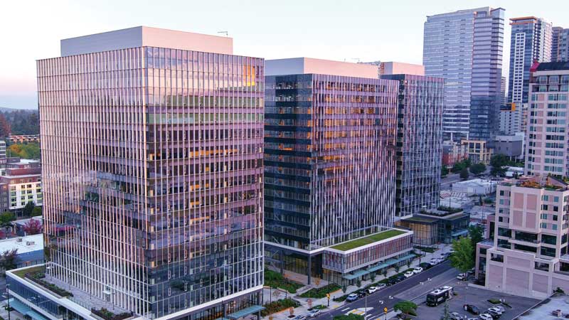
West Main
West Main is a three-tower ensemble, ranging from 16 to 17 stories, occupying a large site in Bellevue, Wash., Seattle’s growing neighboring city. Principally high-tech office use, the site also features ground floor retail, an art program, and a public plaza. Tower one is freestanding, while tower two and tower three are linked at levels one and two by a shared podium.
Limited in size due to zoning constraints, the towers adopt simple rectilinear footprints above the podium. Each tower employs a variant of an offset core to provide flexible, unobstructed workplace floors. The cores were located where towers overlapped, emphasizing views outward from the site while not compromising access to daylight.
Design concept
As a multi-tower project, the design sought to emphasize a cohesive relationship between the towers, reflect important aspects of the context and history of the surrounding neighborhood, and provide each tower with a unique identity.
Early on, it was discovered the project site was once the location of a seasonal streambed—Meydenbauer Creek—which flowed across the site enroute to Lake Washington. This prompted exploring the concept of “flow” both in the site and tower designs. A subtle pattern was mapped across all outward-facing facades, a pattern that ebbs and flows from tower to tower. At podium levels, a similar flow pattern is mapped onto the glass itself, utilizing parametric modeling and digital printing technology to deploy a continuous pattern over individual glass panels on each street-facing facade.
The tower composition further emphasizes the cohesiveness of the site by utilizing two distinct facade languages that change depending on the relationship to the site. Those facing outward from the site were termed the “city faces,” while those facing inward, towards the interior of the site, were termed “inside faces.”
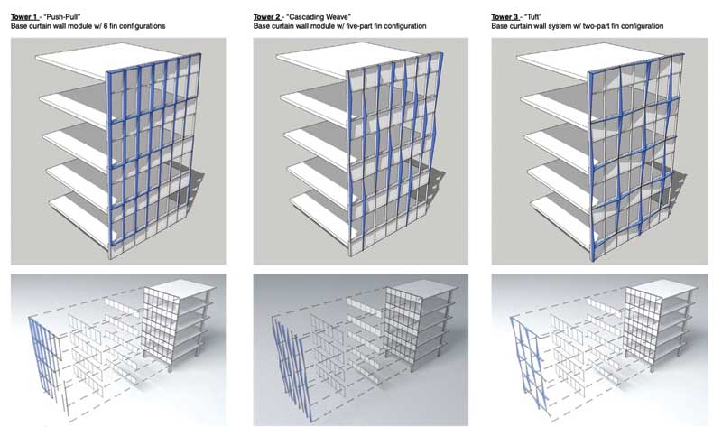
Each tower is further differentiated through exterior curtain wall detailing, each of the towers using a unique vocabulary of fins and projections, each identified by a name: “push-pull,” “weave,” and “tuft” for towers one, two, and three respectively.
Lastly, the opaque portions of the offset cores are their own distinct design element. Clad with tens of thousands of individual stainless-steel tiles, the core walls express a colorway unique to each tower, with a pattern that graduates vertically, featuring more saturation at the base of the tower and less at the top.
Material selection
The tower curtain wall materiality varies depending on location and how it contributes to the overall design concept. Inside faces are a smooth, fully structural sealant glazing (SSG) system and utilize gray-tinted glazing. City faces are highly articulated and receive the “flow” pattern mapping. City faces also uses a more reflective, silver-toned glazing that is common to all three towers.
Podium glazing is clear to facilitate views into retail and promote visibility of the printed flow pattern. Curtain wall framing is a platinum color common to all towers. The podium curtain wall is graphite gray, and the tower fins are white to emphasize the varying pattern from tower to tower.
Focal elements
The project gained great economy by employing the same underlying curtain wall system across all three towers. The unitized system provides excellent performance, aesthetics, and flexibility to incorporate operable windows, a specific tenant request.
As discussed, variation in glazing selection from facade to facade within this system supports the overall design concept. Variation is achieved by using unique custom profiles on the exterior of the system. These vary by tower. Further, differing accent colors at the podium and core wall help make each tower unique:
- Tower one—Push pull
Fins of eight varying depths are utilized in a graduated pattern, framing one side and the top of each unit, creating a fluid wave pattern across the city faces. Fin depths change unit-to-unit by no more than 25.4 mm (1 in.), providing a smooth transition of the flow pattern.
Tower one is the blue tower, utilizing this color in the podium frit pattern and cool tones in the stainless-steel core wall panels.
- Tower two—weave
A range of eight different vertical fins extend the full height of each floor, each with a slightly different depth and angular projection, cloak the city faces of this tower. Like tower one, transitions are stepped in 24.5 mm (1 in.) increments to ensure a fluid gesture. Tower two is the red tower.
- Tower three—tuft
A range of graduated, angular fin projections are utilized in this building, like tower one and tower two. Yet, the projections in this structure are cruciform in their arrangement, each meeting at the high point to create a unique “peaked” pattern reminiscent of the sewing namesake “tuft.” Variation in depth, picking up on the flow concept, lends a dynamism to this otherwise rigorous composition. Tower three is the blue-green tower.
Conclusion
At both the Amazon Nitro and West Main projects, high-performance glazing with low-E coatings was specified to achieve compliance with energy code and solar heat gain considerations. To limit heat transfer to the interior, shallow projections (less than 152 mm [6 in.]) utilize extrusions that are thermally separated from the interior curtain wall framing. For projections more than 152 mm (6 in.), structural support is provided by structural knife plates that penetrate the envelope in limited areas, mitigating thermal transfer. Acoustics were also taken into consideration; the systems were wind-tunnel tested to ensure projections do not produce any unanticipated sound, and the short ends of extrusions are capped to prevent whistling or harmonic effects.
These two projects in the Greater Seattle region showcase an integrated methodology towards facade design. This method leverages a pre-engineered, high-performance curtain wall system as a base, complemented by unique, custom elements on the exterior tailored to each project’s design principles. Close collaboration with the client, contractor, and envelope supplier facilitated extensive customization, effectively balancing costs with considerations for constructability, durability, and performance. These endeavors not only enhance the aesthetic appeal of the urban landscape, but also demonstrate a commitment to pushing the boundaries of architectural expression while meeting the practical needs of clients and communities.
Author

Peter Krech, a founding principal of Graphite Design Group, is a seasoned design leader whose professional experience includes an array of project types, including commercial office, retail, mixed-use, and high-rise projects in the U.S. and Asia. He integrates the diverse components of complex, multi-faceted projects while balancing technical and environmental challenges. With his colleagues at Graphite, he creates vibrant, cohesive, memorable places that meet clients’ experiential, development, and economic objectives.

